
In her debut collection for Mitzi, Ariel translates her “traditional with a twist” aesthetic into lighting design. Tailored silhouettes paired with varying shades of signature AO blues, hints of brass, and subtle texture evoke the essence of Ariel’s design work to deliver a perfectly edited collection of classics. “It is my hope that these designs make the spaces that they live in sing.”
All Lifestyle Images: Design, Ariel Okin @arielokin, Photo, Donna Dotan @donnadotanphoto, Stylist, Anthony Amiano @anthony_amiano
My hope for this collection was that every piece could be mixed and matched together in the same home.
Varying the shades of our signature blues, adding hints of brass, and incorporating texture were all very important style notes when designing this collection, in order to evoke the types of palettes, materials and textures we include in our projects.
I often say that designing is the ultimate privilege, because we get to create the "movie sets" that our clients live their lives and create lasting memories in, so to see our physical product in people's homes is an absolute honor.

I love the faded effect in our signature blue hue on the Aimee; the gourd silhouette is one we use often and I always prefer an empire shade. Aimee was named after my mother!

Texture is key when designing in a tone-on-tone palette; the Annabelle is an exploration of that idea. The natural linen empire shade plays nicely with the subtle polka dot detailing in relief on the ceramic base, creating a small but mighty statement lamp.

We often incorporate bamboo in different ways in our work, be it through furniture, mirrors, accessories, and more. I loved the idea of translating the shape of bamboo to lighting with Banyan; the heft and usability of the table lamp is something I am really proud of!

Exaggerated, chunky silhouettes are a go-to when sourcing table lamps, and the crackle-glazed powder blue of the Clarendon was inspired by our signature colors. Designed to add a special touch to a formal living room or bedroom, or anywhere in between, the Clarendon is a personal favorite.

The idea behind the Dunbar was to take the classic English lantern silhouette and update it with equestrian detailing. The horse bit and grommeted chain detailing add polish to an already classic staple.

Named after the street I grew up on, and now my editorial and e-commerce site, Fenimore Lane, the Fenimore is an extremely versatile pendant perfect to be used in the kitchen, offered in two versatile colorways.

Inspired by my two daughters! The Fifi works double duty as an adorable art light that also adds some scalloped charm to any space.
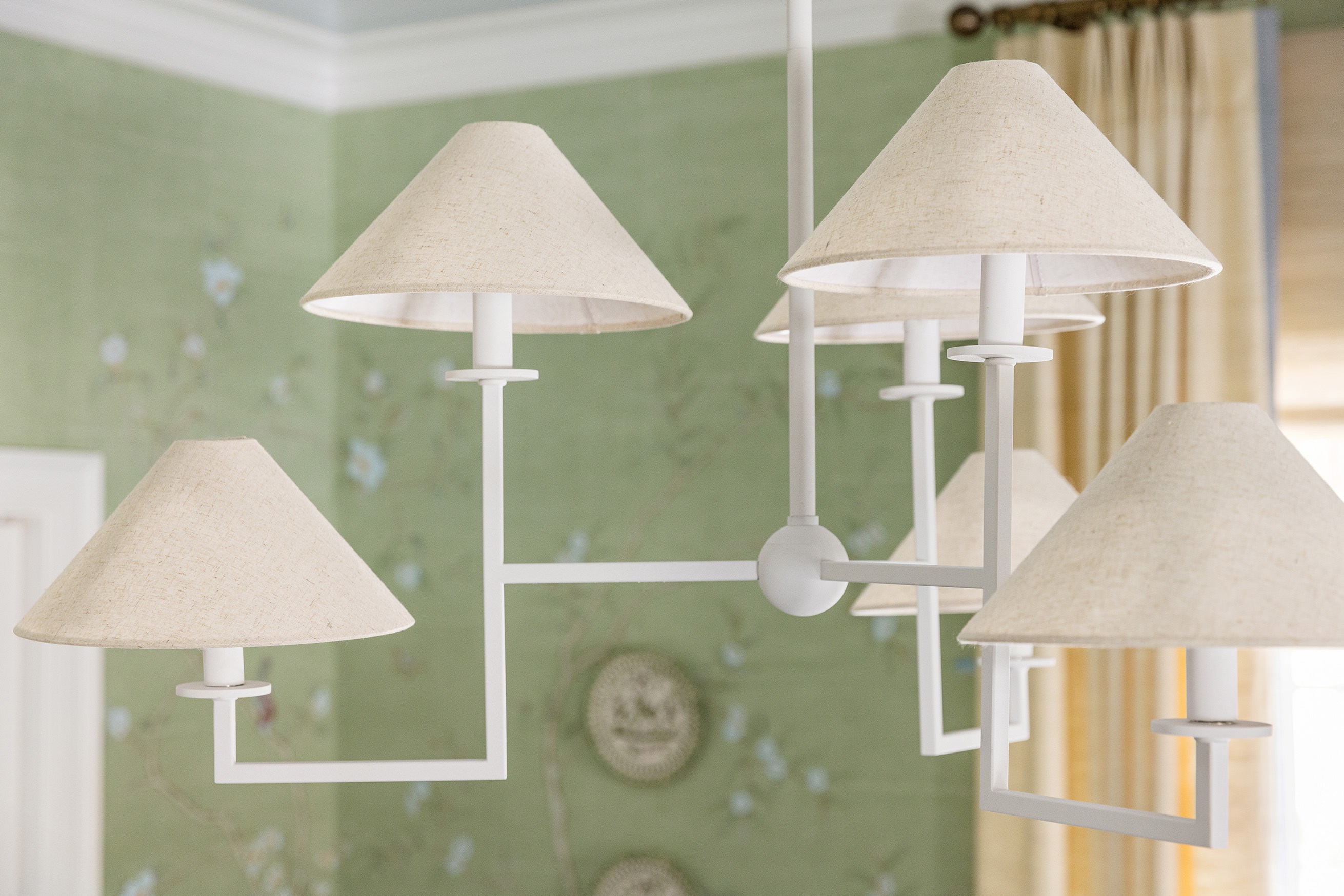
Named after the town I grew up in, the Gladwyne is inspired by a plaster chandelier I had in my first apartment in New York. Plaster is a finish I often use in almost every project for its versatility and ability to add patina and texture; we updated the silhouette with beautiful textured natural linen shades and expertly crafted joinery.

I grew up at horse farms as a child, and equestrian detailing is a beloved classic silhouette that often finds its way into my projects. Here we used the horsebit shape to create Haverford's beautiful sconce and chandelier family.

Basketweave and plaster are two of my favorite textures – here we incorporated both with the Susie table lamp in an elegantly shaped conical design that can work in virtually any space.
Ariel Okin x Mitzi is available now! Follow along on Instagram for more details and exclusive content about our sixth Tastemaker collection.